
When the AutoZone Mobile app was released in 2010, it was one of the first & few in the after-market automotive category. It brought with it convenient access to pricing & store availability right on your phone.
In years since its release, the app took a Cinderella treatment to many other initiatives. Without a fully dedicated team and time to truly invest in navigating the fast-moving mobile space, the app struggled to stay parallel with the company roadmap and keep up with similar experiences in the e-commerce industry.
I was part of an ambitious project to take a brownfield approach to redesign the AutoZone DIY Mobile App experience.

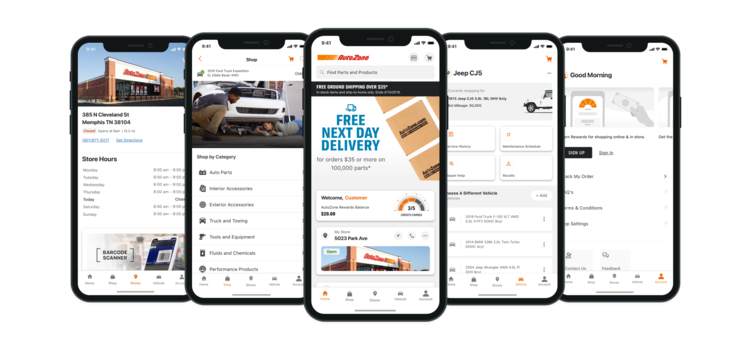
Evolution of the mobile app from 2010 (left) 2018 (middle) and 2020 (right).
To comply with my non-disclosure agreement, I have omitted and obscured confidential information in this case study. All information in this case study is my own and does not necessarily reflect the views of AutoZone.
The Challenge!
Catch up by 10 years but do it in only 2
Catch up by 10 years but do it in only 2
Our goal for this project was to rebuild the foundation of the app turning it into a true product that could not only support the growth of the business but also bring value to our users.
The ask: take a 10-year-old product, modernize it, make it stable, usable, and valuable in 2 years. Easier said than done, but with the right team and the right mindset, nothing's impossible right? right?! 😅
The ask: take a 10-year-old product, modernize it, make it stable, usable, and valuable in 2 years. Easier said than done, but with the right team and the right mindset, nothing's impossible right? right?! 😅

My Role My role for the project began as a contributor mostly responsible for research & user experience design. Mid initiative I transitioned to be the UX design lead, responsible for coordinating end-to-end wireframes and mockups. If I were to break it down my day to day might include:
- Strategizing with PO’s on upcoming roadmap items, refining user stories & evaluating progress on KPI goals.
- Working with UI to choose which hills to die on, conducting user research, defining user flows, helping with prototypes for testing and hand in hand fighting (and sometimes losing) battles for experience improvements.
- Collaborating with my fellow designers to produce hi-fidelity comps, design interactions and finesse the details.
- Bridging the gap between design and implementation, collaborating with developers on wireframe documentation and research for in-progress features.
- Reaching across the aisle to my web design counterparts & the design system team to ensure consistency, challenge the status quo & prepare for cross-platform features.


Graphs, Analysis, and Interviews, oh my.
Getting informed
With millions of people already using the app in a million different ways, we needed to take the time to deconstruct. Partnered with a 3rd Party Research team we broke out our analytical skills to complete a competitive analysis and conduct a pulse check on the current app's user base.
Early insights:
We knew from the current market that users' expectations for mobile e-commerce had grown beyond pure catalog functionality. Through Q&A sessions with stakeholders and user interviews, we were able to take a fresh look at the current user journey to identify three critical pain points.

1️⃣Fundamental usability & stability were challenged
Beyond the notes on the dated UI, we found that users were
frustrated with the navigation & sluggish response times.

2️⃣The app specific feature set was lacking.
Compared to similar e-commerce apps, users felt we weren't up to par. They expected us to take full advantage of the power of a native application to enhance the experience.

3️⃣Disparate & under developed features made
omni channel efforts difficult.
Users were disappointed in the lack of cross channel efforts. They expected a level of feature parody with the site and the ability to seamlessly switch between platforms.
Some of what we learned during this process matched our hypothesis: the app was hard to use, dated & slow but we were was surprised to learn just how much user expectations had evolved. The app wasn't necessarily a one stop shop anymore. Users didn't create a defined line between app and brick & mortar, but rather considered them each a contributor to the AutoZone Experience as a whole. Convenience was the deciding factor on which to use at a given time. Taking this dynamic into consideration we came to our overarching goal:
Create a mobile experience that extends AutoZone's customer -
first mindset & convenient services beyond the store walls.
Create a mobile experience that extends AutoZone's customer -
first mindset & convenient services beyond the store walls.

A room, a whiteboard and some dreams. 🌙
Exploring the Opportunity & Defining the Vision: Finding where the app fit into the wholistic customer journey.
We’d gathered a little background, learned where we’d come from, then came time to break the mold, let our minds run wild. The reality was, our current product had little to no vision. We were about to embark on a journey without a North Star. But rather than looking at that as a negative, we saw it as an opportunity, a clean slate.

|

|
From the integration of OBD2 readers to geofencing for in-store modes and live chat help. The ideas flew in copious amounts. We wanted to create the most valuable tool in the garage: A Personalized Vehicle Centric Experience.

Now let's be clear, faced with a mountain of technical debt, a tight deadline and even tighter resource pool we knew that these ideas weren't achievable....not yet. But one thing that I learned through this whole process was that having vision is important. It's hard building a house without plans, it's hard building a product without a roadmap.
And since I'm making architectural puns how about we speak foundations 🙃.
Our Foundational Goals:
📌 A tool that earns higher levels of customer loyalty
Create intuitive and enjoyable self-service experiences that build trust and empower customers to nurture a long-term relationship.
📌 Fast and Seamless shopping experience
Enable quick and streamlined shopping and checkout experience for customers who know what they need.
📌 Guide customers to the right decisions
Provide consistent and personalized recommendations to make sure customers find the right part for the right job, every-time.
Keeping it Real
Defining the MVP
We'd explored outside the box and concepted what we thought would be the perfect product. Then came time to garner expectations & define the MVP. With fluctuating priorities and resources we needed to be flexible, agile😉.
Planning was open and collaborative guided by user expectations & requests, level of effort to complete & quality of the experience we could deliver given our constraints. We prioritizing incremental improvements of core functionality with frequent releases, over complete overalls and shiny new features. Our users had waited long enough.
Post every release, we would closely monitor user feedback, exterminate bugs, polished the visual design, and finesse the details. It was a process and it was beautiful.

The Redesign
Hey Alexa, play “Don’t call it a come back”
With the updated AutoZone app, it’s easier to take care of your vehicle than ever before.
Order the right parts and accessories for your car or truck with just a few taps. Get the parts you need fast with same-day store pick up or convenient ship to home delivery. Track your AutoZone Rewards balance and get information on your local store straight from the home screen. With AutoZone on your phone, you're that much closer to getting back on the road.
Designs in collaboration with Simon Hua, Destani June & Ben Haag
Guide Customers to the Right Decisions
Manage Vehicles
View DIY suggestions with maintenance Info, check your vehicle's specifications, keep track of all of your vehicles in one convenient place.
Manage Vehicles
View DIY suggestions with maintenance Info, check your vehicle's specifications, keep track of all of your vehicles in one convenient place.

Fast and seamless Shopping Experience
Buy Online, Pick Up in Store or Ship to Your Home
Browse, research, and check availability from any of our 5,500 stores across the United States. Easily get the parts you need the same day with store pick up or have them shipped directly to your house.
Buy Online, Pick Up in Store or Ship to Your Home
Browse, research, and check availability from any of our 5,500 stores across the United States. Easily get the parts you need the same day with store pick up or have them shipped directly to your house.

A tool that earns higher levels of customer loyalty.
Track your AutoZone Rewards balance, view your activity, and have easy access to your AutoZone Rewards card in one convenient place.
Track your AutoZone Rewards balance, view your activity, and have easy access to your AutoZone Rewards card in one convenient place.

How We Got There
Defining the most useful, & time effective design strategy.
Keeping with the theme we went into the redesign focused on the foundational work needed to get the app in an optimal state to consume new features. This meant the UI needed to be simple, flexible & timeless.
Our guiding principles:
👆 Keeping the integrity of the platform
Though we were switching to react native and a shared codebase between iOS & Android, it was important that each application align with its native host, keeping the familiar interactions and architecture. HIG & Material Guidelines were our best friends!
✌️ Focusing on Information Architecture
By saving time, and not focusing too much on the surface, we would be able to put the effort where it would really count. This meant cleaning up the UX from navigation restructuring, clear typography patterns, and ADA standards to dropping the dead weight of antiquated features.
👌 Thinking in scalable & reusable components, not one-off solutions
Do it once, do it right. We practiced thinking holistically, creating patterns and flexible reusable components that could have a wide range of usage. This not only saved on dev time but more importantly started to weave patterns that users could become familiar with throughout the experience.
Not all sugar, spice, and everything nice
As with any major project, this process was not easy. As expected we hit a few snags along the way. I won't get on my soapbox but here's a synopsis:
📌 Considering Brownfield? It's no cakewalk.
Spaghetti code, legacy services, multiple languages, it was quite the balancing act. We became familiar with the heartburn of making concessions and figuring out workarounds. But we sucked it up and got it done, we knew that churn for us meant smoother sailing for the user.
📌 Small team, big business appetite.
You know that quote "People don't know what they want until you show them." - 🍎 What did we show them? A futuristic (like way down the line) vision of a product. When did they want it? NOW. We know, sometimes when you're not in trenches it easy to become a little impatient, wonder what's taking so long. We didn't like it but we understood it.
📌 The voices...so many voices.
At the beginning of the project, we were given a staggering amount of leeway almost completely uninfluenced by the external product teams. That bubble didn't last long. As the project's success became more and more apparent, people started to pay more and more attention. It was a blessing and curse. More eyes meant more voices and more voices meant growing pains. It was a good stretch of those collaborative muscles.
📌 Ch-ch-ch-ch-changes.
Two thumbs up for agile practices and cross platform features. A million thumbs down for minimal communication. This project came at a pivotal time in our company, the era of omni channel: new website, new app, new design system, new processes and hard to kick old habits. Previously the app and the site had completely separate roadmaps but as they converged, our teams collided. We didn't always do our best at assessing impact and keeping each other in the loop. But let's be honest here, our company is on the far side of thirty with some rich hefty history, some slow movement was too be expected.
At the end of the day the challenges we faced as team were well worth the output. It's rare that you have the opportunity take on something so big with a group of worth while folks.
The Most Robust Update Since 2010
On Nov 29, 2020 the fully refreshed app launched. The redesign has proven to have a positive impact on the AutoZone mobile shopping experience:
🎯 More than 20% increase in installs
🎯 +80% increase in sales
🎯 Boost in app store ratings from ⭐️2.7 to ⭐️4.7
🎯 Better pass rate on usability testing
For confidentiality reasons I have omitted the actual values for some of these metrics.
